One of the – in my opinion, very few – useful insights to come out of “management theory” (broadly construed) is summed up by the famous expression “Fast. Good. Cheap. Pick two.”
Though it most often gets applied to software development, I can think of very few domains where this expression doesn’t apply, and tabletop game design is not one of the exceptions. In case the concept is new to you, the basic idea is that (at best) you can do a thing fast and well, but it will cost a lot; cheaply and well, but it will take a long time; or cheaply and fast, but it’ll suck.
I guess it’s pretty obvious by now that I’ve chosen the second option, or rather, sort-of chosen it and sort-of had it imposed on me. Part of the issue is that I ran out of money before I ran out of project, and so to continue it I’m having to learn to do things myself that I could get done faster by hiring someone.
The main one of these is layout. I’m no graphic designer, but the basic book layout elements are the main thing I’m currently tackling. At least this way, I get to make sure things are exactly the way I want them. But it’s more involved than you probably think.
When I said last time (which was an unconscionably long time ago, sorry about that) that I was 70% of the way to having something complete and playtestable, I meant writing it. I was just-barely thinking about art and graphics, and I’d totally overlooked layout.
So, where do things sit right now? Well, the finished product will consist of two main books, the Core Rulebook and Character Reference, and sundry other bits. (This will all be sold together as a single package; you won’t have to make multiple purchases.) As far as writing and layout go, I’d say right now:
- The Core Rulebook is at least 80% written (and most of that text has also gone through a professional editor), and slightly more than half of that has a preliminary layout. It needs some graphic elements and may have to be changed to accommodate illustrations, but it’s a decent presentation of the rules as it stands.
- The Character Reference is 95% written and about 80% of that has a preliminary layout, though about half of that (the ability descriptions) still needs some tweaks before I’m happy with it, even discounting the potential for adding illustrations and stuff.
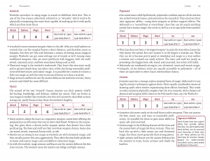
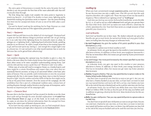
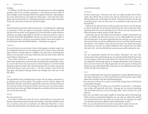
Here’s three sample spreads from the Core Rulebook. Note that these are intended to be printed as spiral-bound books half the size of a typical RPG book, so these each represent two facing pages which will be, put together, the size of an 8 1/2 by 11 sheet of paper.
The first introduces half the classes (the warrior, scoundrel, dan, and alchemist are on the spread before this one; I call this spread “one mage, two mage, red mage, blue mage”).
The second has the end of the example of character creation on the verso, and the beginning (most, really) of the rules for levelling up on the recto.
The third is part of the section on status ailments. This was easily the most fun part of the rules to write, by the way.
You can download these as .pdfs as well:
2.0 Characters sample spread 1
2.0 Characters sample spread 2
3.0 Battle System sample spread
As you can see, they’re pretty presentable already but would benefit from the addition of some further graphical elements. Most obviously (to me), I want colour bars along the sides, which I haven’t got around to adding to my master pages yet because I want to bounce some other ideas around with a graphic designer or two first.
(There is, or used to be, a perception in the industry that colour bars add too much to your printing costs to be practical. Frankly that’s BS. I have yet to speak to a printer who thinks they’ll add appreciably to the cost at all.)
Another obvious thing that makes these not-quite-the-finished-product is that in the first one, the [per] and [pre] notations next to each class’ starting hp and mp need to be replaced with symbols for the corresponding Heroic Traits. I already have designs for these, but I haven’t worked them directly into these files yet.
So, that should give you some idea where the Fantasy Infinity project currently is. As always, I’m keeping promises to a minimum as to when it will be finished, but here are three. It will be good. It will be as inexpensive as I can reasonably make it. But it will not be fast.


Comments 1
Looks pretty sharp to me. If I saw these pages in a rule book I picked up at a shop, I would not think twice.